The right font can bring an animation to life, make a character pop, or set the perfect mood for a scene. Anyone who works with design of any kind can tell you that, and it’s especially true for animation.
And whether you’re a budding animator or a seasoned designer, keeping up with the most popular fonts is important for making your work feel fresh. As animation continues to evolve, the fonts we use are dancing right along with it. Want to see what the most popular font styles have been lately? Let’s dive in.
What To Look Out For For Fonts In Animation
When it comes to picking a font for animation, there are a few factors that make certain fonts better than others. The first is legibility. If you’ve got a message to send, you have to make sure it’s easy for everyone to “get” quickly, especially since things in animation can zip by so fast.
It’s all well and good having a stylish font, but if it can’t handle a bit of stretching or twisting without looking weird, then it might not be the best pick. So, in a nutshell, the right font for animation is clear, has a bit of character, and can roll with whatever effects you throw at it.
Top 10 Fonts to Use For Animation in 2023
1) Morro
Geometric and blocky, Morro adds an extra dimension to any animation it’s a part of. These basic shapes are like building blocks in animation, offering a structured and easily manipulable form that fits into the movement and style of any character, object, and scene.
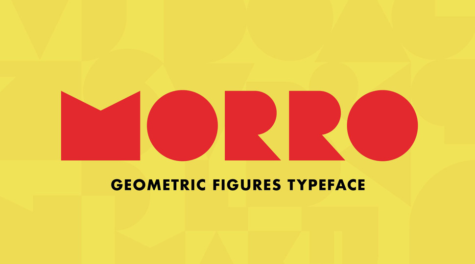
Picture paper cutouts shaped like letters. This minimalistic yet dynamic look underpins Morro’s appeal in the animation realm. It’s perfect for conveying narratives and captivating visuals in a modern, trendy manner.
2) UniSans
A classic sans-serif font with just that bit of blockiness to make it unique, Uni Sans is an all-rounder for any type of animation. Embodying the key characteristics of sans-serif fonts – top-notch legibility, refined geometric designs, precise kerning — it’s clear why it stands out as an exceptional choice for animation.
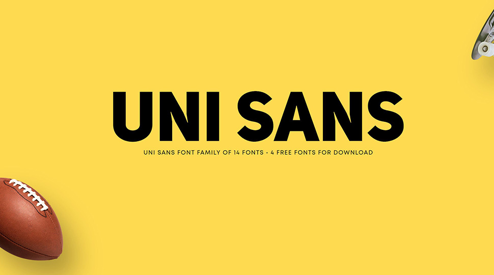
Drawing inspiration from iconic grotesque typefaces like DIN and Dax, Uni Sans adds its own distinctive and modern touch to classic softened geometric forms. This versatility translates well in animations, making it perfect for headlines and varied text blocks while aligning with contemporary design trends.
3) Vulf Mono
Looking for something with a touch of whimsy? Vulf Mono is a serif font that looks almost like the classic typewriter-style Courier New, but with additional curves that make things much more fun.
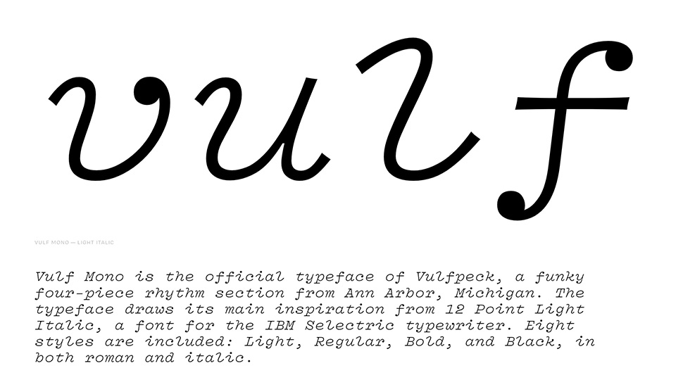
Derived from the aesthetics of 12 Point Light Italic, a font originally designed for the IBM Selectric typewriter, Vulf Mono exudes a funky and nostalgic vibe. Its distinctive mix of contemporary design elements and that timeless typewriter look makes it a stylish choice for animations of all styles.
4) RBNo2
Stocky and straight, RBNo2 is a gothic sans serif font that adds a modern feel to anything it appears in. Its unique blend of late 19th-century industrial font aesthetics with German-inspired straightness and geometry makes it especially suitable for animation.
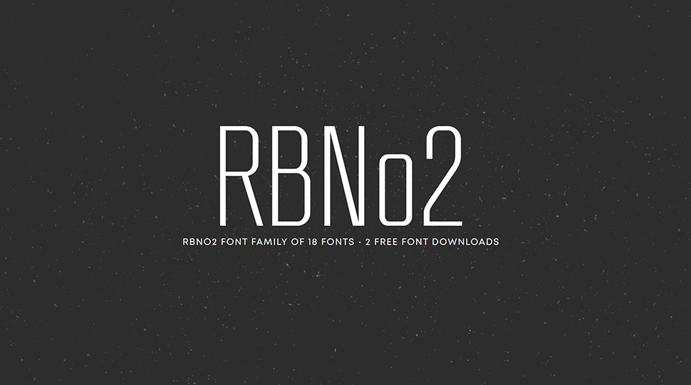
The result is a compelling design that commands attention when utilised in animation for headlines and brief text. Its inspiration from industrial fonts infuses it with a distinct and highly appealing look. Something to add a kick to any geometrical animated content. If you’re going for a more modern and technical feel, you’ll want to check this font out.
5) Grand Hotel
If you’re looking for a font reminiscent of those fancy calligraphy videos all over TikTok, Grand Hotel is the one for you. Deriving from timeless aesthetics, this font combines a condensed upright connecting script with a classic flair.
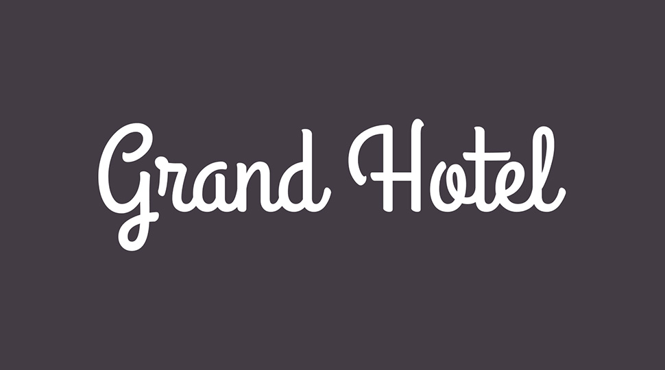
This fusion of vintage elegance with modern appeal gives it a graceful appeal that’s great for more whimsical animations. The connecting strokes and curves also make it ideal for the movement inherent in animation and motion graphics.
6) Code Next
Minimalism is timeless, and the sans-serif Code Next is the epitome of that principle. It strikes a balance between stylisation and simplification, enhancing the legibility and versatility of the font. The thin, straight look of these letters lends well to visuals that play into geometry, fitting nicely into a precise and clean look.
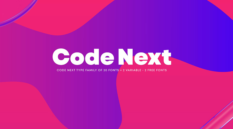
This razor-sharp look not only gives a contemporary and minimalistic look to animations but also ensures that any message conveyed is done so with utmost clarity. With such functionality, there’s no wonder why this style would be popular.
7) Liberator
Clear yet eye-catching, this bomber-inspired font calls back to the aesthetics of the 1950s. Liberator is a distinctive and condensed typeface that draws conceptual inspiration from the vintage era. With its roots in military aesthetics, it emanates a robust and masculine essence that can add a twist to a wide array of design projects.
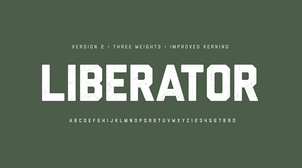
This historical and rugged look makes Liberator an exceptional choice for evoking nostalgia. And with its blocky look, it pairs well with motion graphics for both clarity and visual appeal in animations.
8) Alaca
Alaca is a cutting-edge font characterised by its contemporary and dynamic octagonal form. This unique structure means that you can get seamless integration of each glyph for a cohesive look. For animators, this translates to smooth transitions and visually appealing typography that can be animated effortlessly.
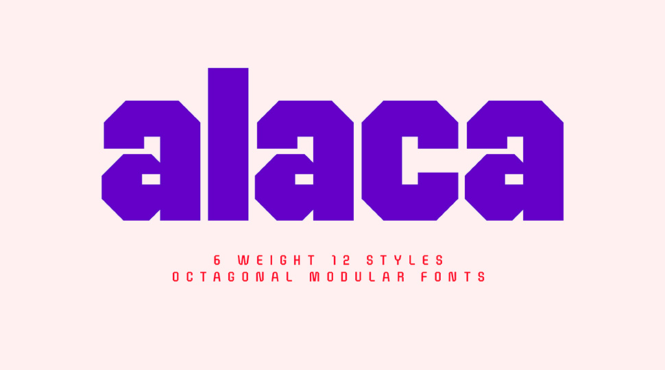
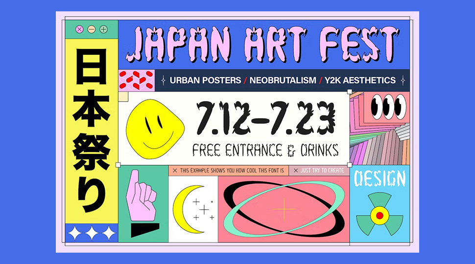
This geometric look also lends Alaca a sort of ‘digital’ look reminiscent of the techy Y2K look that’s trending right now. So between its flexible nature and dynamic look, it’s a style that’s a no-brainer for the current popular aesthetic in animations.
9) DigiBop Y2K
Y2K is all the rage nowadays, and there’s no better way to ride the wave than with a retro font like DigiBop Y2K. Drawing from the 90s and early 2000’s nostalgia, DigiBop infuses a playful and bold essence into the Y2K trend, making it a trendy choice for animation.
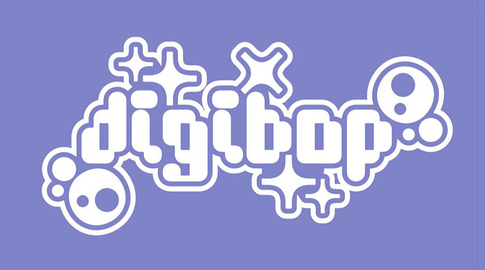
Think a blend of modernity and retro aesthetics, with that contemporary feel of this iconic style. In addition to this hot look, the font’s unique shape lends well to animation and different designs. This is a font that you can have fun with!
10) What-A-Bloat
This one is a bit of an abstract font. What-a-Bloat is an exciting and nostalgic font that draws inspiration from the late 90s to early 2000s bubbly aesthetics. This font encapsulates the Y2K grunge style with a touch of graphic neorealism.

Its unconventional design means that the typeface would not look out of the ordinary if warped or stretched, so it’s a great choice for any animator. Its connection to the trendy look of the past and fluid look makes it a go-to font for animated content that needs a touch of a dynamic and edgy vibe.
In Summary
So, it’s clear that the right font can make all the difference. And as commercial animators, keeping up with what’s popular can be vital for marketability. But at the same time, make sure to prioritize other important factors, such as legibility and flexibility. This is to ensure that your font works well in animation. Ultimately, finding that perfect balance will set your animations apart and captivate your audience.