A startup has a lot of things to take care of. One of them is to increase their online presence, which is impossible without making a beautiful website. What is a beautiful website? It’s the one that develops decent engagement and drives maximum conversions. If you are thinking about making a website for your startup, the following are some of the most successful and creative design ideas to get inspiration from:
1. Hotel Tonight
The great thing about the hotel tonight’s website design is its unapologetically easy layout, which makes navigation ridiculously easier. All the imagery on the website homepage provides value to the user, either in the form of the necessary information or persuasive elements such as testimonials.
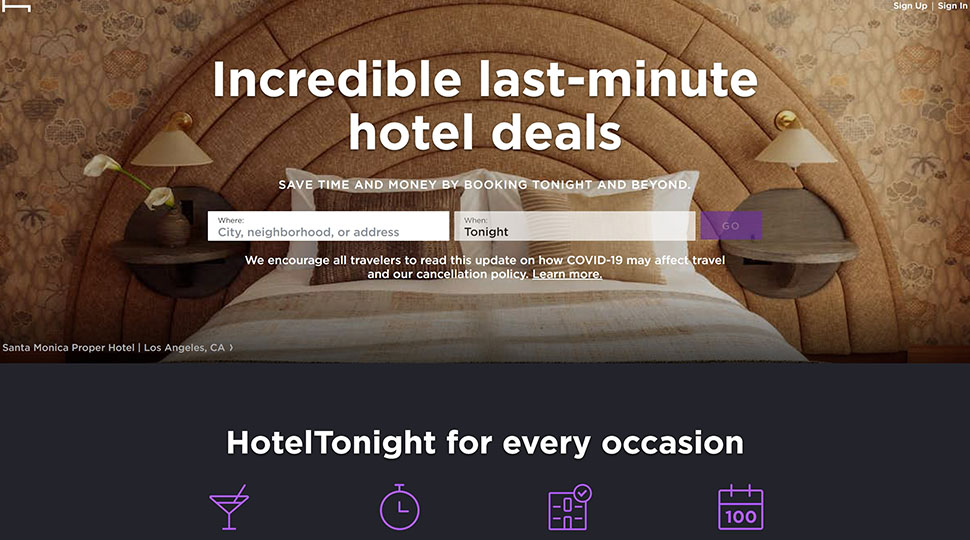
For example, as the hotel tonight provides a booking service, the first thing you will see on their homepage are two blocks. You enter the city in one block and the day or date you book the room for. As you scroll a little, you will see all the cities where they operate, so on and so forth.
In other words, it’s all about instant value!
2. Exposure
Exposure is a place for visual storytellers where people can host exceptionally high-quality videos and images. The thing that makes their website design so better is that every aspect of the website reflects what the website is all about, with just the right amount of appeal to the target audience.
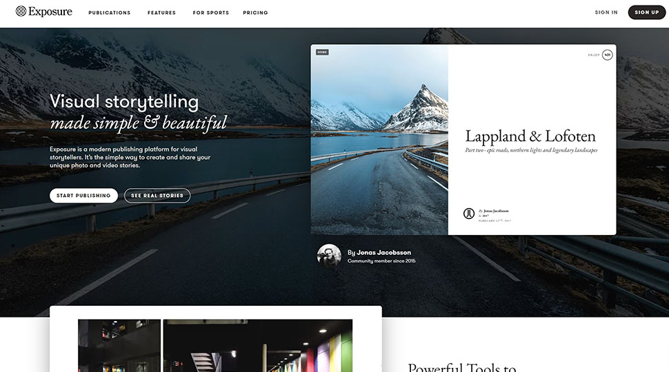
Plus, the website has a CTA button scattered throughout the homepage, situated below compelling headings targeted toward each specific group of storytellers. All in all, a great website that serves its purpose well.
If you are making a website that is mainly targeted toward creatives or provides services that are in some way connected to them, this is a pretty decent website design to get your users intrigued.
3. Drop Mark
Drop-Mark is a tool that enables users to manage links, documents, and notes, providing them the much-needed convenience they need to handle their office tasks more efficiently. Since the services of Drop Mark is all about disciplining workflow and arranging data, the creators thought, why not reflect it in our website design?
And guess what, they were right! It sure worked out well for them. The website design is as simple as it could be. The only thing unique is how they have categorized every product or subscription they provide. Plus, they have embellished their home page with one of the most in-trend aspects of web design; animation!
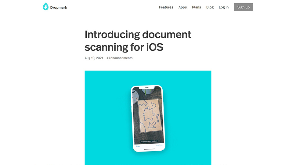
The vibrant overall website theme is accompanied by great UX, easy navigation, and visual pleasures are all that make the Drop Mark website so successful. You could also use an animated video to make your website more effective. If animation is not suitable for your type of business or service that your website offers, you can opt for a corporate video. To get some inspiration, I’d recommend checking some of the animated explainer video examples here.
4. Coda
Coda is everything that a great website design is all about. A catchy phrase that clearly defines the product’s primary purpose, generous use of animation that keeps on providing information about the use of the platform with every scroll, and most of all, a concrete animation explainer right beneath the main image of the website.
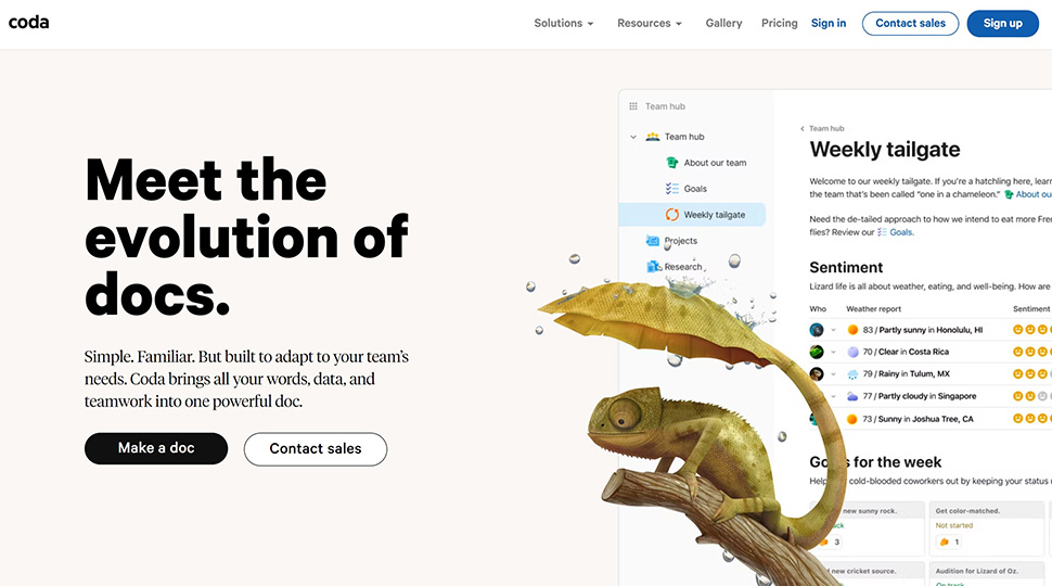
Plus, they also let you make one document for free to check out how the thing actually works, which is a kickass move that could get any business some real conversions. What made us love this website and why we strongly recommend anyone to follow the blueprint is simply that the design is a perfect balance of everything, from functionality to design and anything in between. The use of animation is just a cherry on top.
5. Utrust
Not many startups are being put on the map due to their stellar website design. That said, the Utrust website is one of those factors that played an enormous role in boosting the brand’s popularity. Unlike many other brands that stuck to outdated design ideas, Utrust succeeded because it embraced modernism.
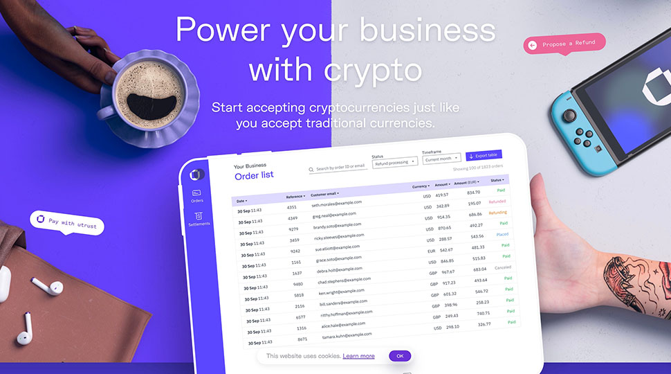
The Utrust website uses motion graphics right at the top of the home page. However, this inclusion has more of an educational purpose rather than just being an embellishment. It actually tells the users how the thing works. The overall color combination is also quite minimalistic that won’t overwhelm the viewers as they scroll, with clear text and a compelling CTA.
The website is simply the true embodiment of what a highly interactive webpage looks like, which has been one of the most significant factors that made the website so successful. Just a piece of advice, don’t over-animate your website if you aspire to follow the same path. It can really kill the website’s speed because of the huge size.
What Makes a Great Website Page?
Once you get past the creative block and find a great template to follow for your website design, things get pretty straightforward. However, there are still some things you need to firmly adhere to as you make a true conversion booster. Following are some of those:
1. Keep Information a First Priority
If a lead doesn’t really understand what’s on your website, you don’t stand a single chance of convincing him. Since an excellent website design is simply about providing value, its content should be outstanding. A few ninja techniques to make your website more readable and attractive include simple design, easy navigation, and a very conspicuous CTA with distinct color from the rest of the website.
2. Make Your Website Adaptive
You may already know this, but about 4 billion of the world’s population use the internet via mobile. That said, there’s nothing else to explain about the importance of making a website adaptive. Ensure your web page performs well on every device and provides maximum value on even the smallest screen. However, don’t forget to fit in the CTA!
3. Make Use of Animation
Pick up any great website design, and you will see why animation is considered the real shiznit in modern marketing. It compiles tons of information in just a single image. Second, it adds a very pleasing vibrancy to your site that keeps the user engaged for a long time. The best thing? You can use it in many forms.
The most prevalent types of website design include JSON, motion graphic GIFs, and videos. Though JSON and GIFs are more economical, an animation video is the absolute conversion beast. Not only does it improve your SEO, it also has the power to persuade your audience like nothing else.
Conclusion
A decent website can significantly affect your overall user engagement. To make sure you don’t lose potential leads, it’s crucial to design your website in a way that keeps your audience gripped, with a pinch of persuasion to make them click on that CTA button.
In this article, we shared with you some of the most creative and practical web design ideas to get started with your website. Since all the ideas mentioned above have been picked from successful startups, you can follow any approach and be sure that it’ll work…until you come up with something better.
Need An Animated Video for Your New Website?
If you need animated video for your new website, look no further. Our team has more than a decade of experience in creating jaw-dropping animated videos. We won many awards along the way too.
Get in touch with our team here for a complete (no strings attached) video guide and consultation.